Friday, October 29, 2010

Emilio Gomariz GIF's..

I love GIF animation.. and this one caught my eye the other day. Epic.. "xtremity" by Emilio Gomariz.

Emilio is an industrial designer and art director working in Madrid.

"I love creativity and I like to see how the people express it in many different ways: photography, art installations, product design, architecture, animation, technological and digital projects. That’s why I did TRIANGULATION BLOG, a meeting point and a source of inspiration opened to artists and designers around the world".

Thursday, October 28, 2010

Animation 101: Importance of Thumbnails..

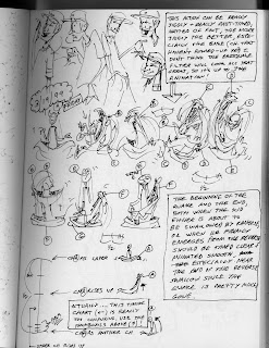
Animation takes planning.. it's not something you can just throw yourself into and expect anything to work. I'm often frustrated when my students get ahead of themselves and just start vomiting lines everywhere, and then act disappointed when it doesn't move like they wanted it to.Do yourself a favor, get off the computer, open your sketchbook and PLAN your action. Every hour spent planning will save you twice that time animating. Animating is difficult and takes some patience.. you need to come to terms with this difficulty and start from there. Below is a page from my sketchbook dated March 1999, from when I was working on my first film "DRINK", (note the sketches on the top from MTV's Downtown, the show I was working on at that time). I found this the other day, and my first thought was that I had "over thought" that scene.. but being that I was a VERY beginner animator, I think I did exactly the right thing. I was so worried back then about whether I could actually do it, that I planned everything out way ahead of time... I even showed my thumbnails to experienced animators that I was working with at MTV to get feedback on design and timing. I remember that I showed some thumbnails to animator Eugene Salandra (he was the best animator at MTV).. he looked at it and paused.. and said.. "this might work. Are YOU going to animate it?" Below: more sketches from "PUPPET"

Wednesday, October 27, 2010

Rare Milt Kahl Pencil Test...

Digitized this beauty by Milt Kahl and Frank Thomas (I think he did Penny) from an old VHS tape given to me by a buddy at Disney years ago, enjoy. View the Quicktime here.

Monday, October 25, 2010

Drawings of Mayumi Haryoto..

Mayumi Haryoto has several drawings that ring close to my heart. I can't get enough of configurations made up of people! (below)Here's an interview with Mayumi... her own website is here, but it's tragically commercial and difficult to navigate. Enjoy.

Sunday, October 24, 2010

The Town

Now that the awards season is starting, as an Academy member, I get preview screenings of all the award-worthy films.

It's an interesting cycle. January to February they play all the films that need the members' votes to win the Oscar, because they are nominated.

After the Oscar event, the winning films play themselves to death, trying to squeeze as much box office as possible before the summer blockbusters open and it's closed season on films with smart content.

Then from September to early October is kind of a grace period in between the big Hollywood extravaganzas and the award season prestige pictures. This is the area that I decided to release “Idiots and Angels”-- it's the easiest time to get screen space.


In any case, in order to get a jump on the awards rush screening, Ben Affleck's “The Town” is being released at the end of September to get an early start on the other quality films.


And what a wonderful film it is! Directed by and starring Mr. Affleck and Rebecca Hall, and supported by “The Hurt Locker”'s Jeremy Renner.

The film is a wonderful slice of Charlestown-- north of Boston. The accents, the bruising hockey culture, and the preponderance of bank robberies makes this film a real treat to watch.

On my scale of enjoyable films, I give it an 8 out of 10. Check it out, you'll love it!

Friday, October 22, 2010

Drawings by eMTe...


I love these drawings by eMTe, someone who I haven't heard of until recently. Hitting on the "gore"-ification of the fashion style drawing. And again, can't get enough of the ink, supported by the wonderful Chinese red for blood.. There's a great interview with eMTe at Texture Culture.

Thursday, October 21, 2010

"Q-Train" by Nigel Van Wieck

This is such a wonderful image by Nigel Van Vieck.. a moment that any New Yorker can relate to.. the loneliness of that city can be crushing, an irony about New York that is never lost on it's inhabitants. It's a perfect painting in my opinion. Thanks Dan Pinto for the ID.One of the many things I hate about bs hipster image blogs is their often lack of crediting artists. They just find images, and puke them up onto a blog, without even the slightest consideration of crediting anyone. punks. come on let's fight. ug.. that said.. I often visit those same sites. I respect that they put the time into finding artwork that I would otherwise not know about.. it's just sad they don't take the extra step by telling us the "who".. so I can view more of their work.

Wednesday, October 20, 2010

Assholes Are Everywhere

My trusted advisor and distributor Allen Chou of Passion River Distribution has been helping me get the word out about the “Idiots and Angels” release.

One clever way he mentioned to spread the word is through a viral video on YouTube. I thought that was a wonderful idea! Besides, it's my job to make funny short films-- it's a natural!

I remembered when I visited Pat Smith's lovely Montauk house-- as we parted into the night, we'd amuse ourselves watching ridiculous YouTube videos on his computer. As we drank more and pulled up weirder virals, it occurred to me that this was free advertising! Voila! How to reach a much larger audience with no investment.

So last week I dreamt up an idea for a funny gag that hopefully will go viral. I took the sequence of “Idiots and Angels” where Angel moons the passengers of an airliner. Then Lindsay Woods, my trusted computer artist, added a few more moons and now we have what we think is a very funny outrageous viral video – at least I hope so – if you think so, check it out:


And please let us know what you think, and if you like it pass it on to your friends. Thanks so much!

Tuesday, October 19, 2010

Epic Sketchbook: Lotte Klaver..

Appropriate that this Epic Sketchbook follows my rant about using ink. I love Lotte Klaver.. great use of black ink brushwork, interesting subject matters and imagery. From Amsterdam.


“For most of the drawings I use black Indian ink, and my favorite soft brush. The people and postures I draw come from my imagination, allthough I’m an observer, and get a lot of inspiration from people I see. “

Friday, October 15, 2010

Legend of the Guardians..

In case you hadn't figured it out, my rush to get “Idiots and Angels” in the cinema this fall is because in order to be eligible for Oscar contention, it has to be released by the end of 2010.

This year has a very promising group of films for my competition, “Toy Story 3”, “How to Train Your Dragon”, and “Tangled”.

It's important for me to try to see all of the animated feature films released this year so I can get a sense of what my odds are. Also, if there are over 15 features released, then the number of nominated films bumps from 3 to 5, which also gives me better odds.


In any case, I rushed out to see “Legend of the Guardians, Owls of Ga'Hoole” (The owl film) to check out my competition. It was directed by Zack Snyder (of “300” fame) with voices by Helen Mirren an Jeffrey Rush.

Even though I saw it on a giant 3D screen, the audience was quite small. My big problem with the film is that I had no idea what the hell was going on and who was who. Imagine a kid trying to decipher who the bad owls are and who the good owls are when they all look essentially alike.

There must be 20 speaking owl parts and other than the hero owl, I could never really get them all straight. The result was that I couldn't really figure out the plot other than there were bad owls and good owls. Consequently I fell asleep numerous times – and thus I probably missed more important plot points.

In my film, I try to engage the audience immediately so I know later I can get very weird, because the basic premise is laid out already.

Even though the owls are rendered beautifully, especially their feathers ruffling in the wind – that's not enough to engage me in a feature-length animated film.

On a scale of 1-10, I give the owl film a 4.

Thursday, October 14, 2010

Charlie White.. Photographer.


My colleague Thomas just illuminated me with this epic photographer, Charlie White, and his series "understanding Joshua", and I've been studying him all morning now. Apparently.. obviously I suppose.. Charlie White puts his persona into these sexually disturbing situations.. a mildly disgusting puppet.. for which we all can express a level of sympathy for, but for unsure reasons (we're too busy dealing with the grotesque). I think we all feel like that puppet sometimes, but don't want to admit it. On another note, Charlie is an expat from New York City.. like myself, another thing I relate to. great interview here from the PBS show Egg.

Wednesday, October 13, 2010

Billboard Liberations..

Been enjoying this section of Wooster Art Collective for some time now. Billboard graffiti has always interested me, ever since working years ago on the show "Doug" with Kaws. It's a fascinating idea, to change images that were meant to be commercial into something truly artistic or socio-political (did i just make that word up?)

Tuesday, October 12, 2010

Audrey Kawasaki.. needs no intro..

All I have to say here is that Audrey Kawasaki's delicate and beautiful renderings add so much to this world. Anything else I would mutter is useless.

Monday, October 11, 2010

Animation 101: Bounce This..

I hate the bouncing ball in a mechanical sense.. animation is about feeling, NOT mechanics.. I know I know.. it's a necessary thing in order to understand Squash and Stretch, Timing, Slow in/out, even arcs.. BUT.. to see the bouncing ball as just a ball is a mistake. It's a living breathing being! So, instead of animating a bouncing ball, animate a bouncing ball FROM A RESTING POSITION and see the ball as AN EMOTIONAL BEING. Furthermore, give the ball a REASON to start bouncing, give the ball EMOTION and PURPOSE. Mechanical animation exercises are just that.. mechanical, boring, un-natural. Stay away. Tell this to the next professor that makes you animate a pendulum (barf). funny thing about the image below, it's not even correct in the mechanical sense, for it's physically impossible for a pendulum to surpass the angle it began without a push. furthermore, the image below doesn't follow arcs, the string actually shrinks during the tweens.. haha.. useless image below.My point is this. ALWAYS think of the emotional state of what you're drawing. Even backgrounds and trees have emotion!

Saturday, October 9, 2010

Evening with Signe Baumane...

BeFilm Festival in collaboration with Society of Illustrators presents "An Evening with Signe Baumane - Signe Dares to Bare" Wednesday, October 13th at 6:30 PM at Society of Illustrators, 128 East 63rd street, $15. Try to make it!!

Friday, October 8, 2010

Thomas Thesen's Figurative Illustrations..

It won't surprise many that I would be a fan of Thomas Thesen's Figurative work.. it shows many similarities to my own paintings, albeit better drawn and thought out. It's a pleasant coincidence that we work together at Tisch! Check out some of his other work as well. later.

Wednesday, October 6, 2010

Animation 101: More on Hands..

Using hands to enhance the emotional poses of your character is possibly one of the most rewarding results of being able to draw hands. I'm shocked at how often people use their hands in going about daily life and communication... hands seem to always be in the picture! matter of fact, unless a character is carrying something or being deliberately robotic, you can pretty much guarantee that hands will be up and around their head doin' stuff!They can act as a protective element that heightens the feeling of that character is hiding him/herself from the world, or the situation.They can be maniacal.. plotting.. thoughtful.. when they are interwoven (another really satisfying thing to draw.. what's better than drawing one hand? TWO hands interacting!). When interwoven hands are low, the character will appear more passive, protecting the heart. But when the interwoven hands are high near the face, they will appear to be concealing something.Hands can express motion SO WELL.. I would be lost half the time if i didn't have the guidance of drag/follow thru created by hands attached to arms. Hands like to "drag" when the character is tired or lethargic. hands "lead" when the character has a bit of spring to them! the key thing to remember is that hands are HEAVY things! if you severed your hand off and weighed it i think you would be surprised how heavy it is. An average adult human hand weighs over a pound!
Just some personal observations I've made about hands:

-Hands are bigger than you think (heads and feet tend to be smaller than you think) often times this is because of perspective and camera angle.. hands have a way of "sweeping" toward the camera, where as heads often are receding, especially in lower angle shots. There's nothing more gratifying that stickin' a big ol' hand into the frame so it covers the shot as it sweeps by!! hands LOVE THE FOREGROUND.. put them there as much as possible! Also, remember to exaggerate how tiny a hand is when it's away from the camera. Perspective often demands exaggeration!!

-Avoid cliche hand poses.. my personal un-favorite is the palm out, pinky up.. you see it everywhere and it's time now for it to go away.. i may die next time i see it. Hands have many parts to use to make a variety of interesting poses, experiment and find configurations that you've never seen before. Also, each character will move and pose their hands differently according to that characters personality.

-Fingers spread out to accent or anticipate an action.. the fingers almost mimic effects lines in this case. use it! If a shocked or surprised character is reacting with hands up, those fingers will be splayed wide!-when drawing (or as i like to say "sculpting with line"), think of the hand as a single unit.. the straight line of the back of the hand will reflect the position of the fingers, the placement of the thumb should relate to the openness of the palm,, etc.. it's a single unit that works very well together, sometimes the fingers don't even have to separate. good luck!

Tuesday, October 5, 2010

Hans Bellmer..

Those turn of the century German artists were just insane. It's not a surprise to anyone familiar with my work that Hans Bellmer would be an inspiration. His twisted drawings are something I could only wish to create... I especially love the way he renders hands (a personal obsession of mine). His work is also very often wonderfully perverted! I have to confess that I've just recently discovered this guy via a coffee table book at a friends house. Later I discovered that friend wrote her dissertation on him at Columbia.. so thanks Syd!Rad fact: Bellmer's work was declared "degenerate" by the Nazi Party, and he was forced to flee Germany to France in 1938.

Monday, October 4, 2010

Animation 101: Fun with Spheres!!

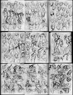
A great way to practice drawing the figure in space is to draw around a sphere. It forces you to think about perspective and where things are balanced and anchored. Practice and experiment, and be creative.. there's a ton of poses that arise when considering a large sphere. It's also really fun:)
The trick here is to remember that the sphere is a large ball sitting in space, and to mimic that weight and presence in the figures you place into it. What I like to do is to draw 15-20 spheres (spheres NOT circles) on a page in my sketchbook, then drop the characters into each form. Use ink, and remember.. there are no mistakes. If you're not falling, you're not skating hard enough.
ps-Welcome to Singapore Victoria!

Friday, October 1, 2010

Blu and Os GĂ©meos in Lisbon...


Epic mural from Blu and Os GĂ©meos in Lisbon. It's nice how Os's character really lifts off the wall. Also, apparently Blu's business guy has suspended eyes that move with the wind. Nice.